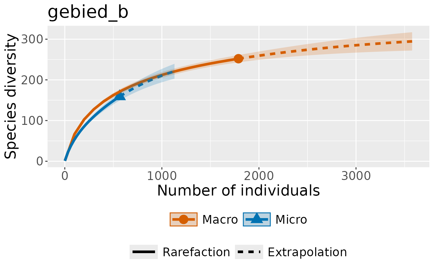
Plot multiple rarefaction curves, split by micromacro for each area.
Source:vignettes/plot-by-area-and-micromacro.Rmd
plot-by-area-and-micromacro.Rmd
data(warande) # example data included in package
dplyr::glimpse(warande)
#> Rows: 2,976
#> Columns: 5
#> $ date         <date> 2009-06-19, 2009-07-01, 2009-08-13, 2009-08-30, 2010-06-…
#> $ species_name <chr> "Bruine huismot", "Oranje iepentakvlinder", "Oranje worte…
#> $ year         <dbl> 2009, 2009, 2009, 2009, 2010, 2010, 2010, 2010, 2010, 201…
#> $ number       <dbl> 1, 1, 1, 1, 1, 1, 1, 1, 1, 1, 1, 1, 1, 1, 1, 1, 1, 1, 1, …
#> $ MicroMacro   <chr> "Micro", "Macro", "Macro", "Macro", "Macro", "Macro", "Ma…
Let’s add some area’s to also plot by:
warande_gebieden <- warande %>%
  dplyr::mutate(gebied =
                  sample(
                    c("gebied_a", "gebied_b"),
                    nrow(warande),
                    replace = TRUE)
  )
Next we’ll group our dataframe by a column, and then iterate over this column to create rarefaction plots. I’m using some more obscure grouping functions from dplyr to programatically get the values of this grouping column, but you could provide these manually as well if you are confident in de order the groups will appear in.
  warande_grouped_by_area <- dplyr::group_by(warande_gebieden, gebied)
  area_names <-
    dplyr::group_keys(warande_grouped_by_area) %>%
    dplyr::pull(1)

  warande_grouped_by_area %>%
  dplyr::group_map(
      ~convert_to_abundance(.x, MicroMacro)
  ) %>%
  purrr::map(~iNEXT::iNEXT(.x, datatype = "abundance", nboot = 5)) %>%
  purrr::map2(area_names,~iNEXT::ggiNEXT(.x) + ggplot2::ggtitle(.y))
#> [[1]]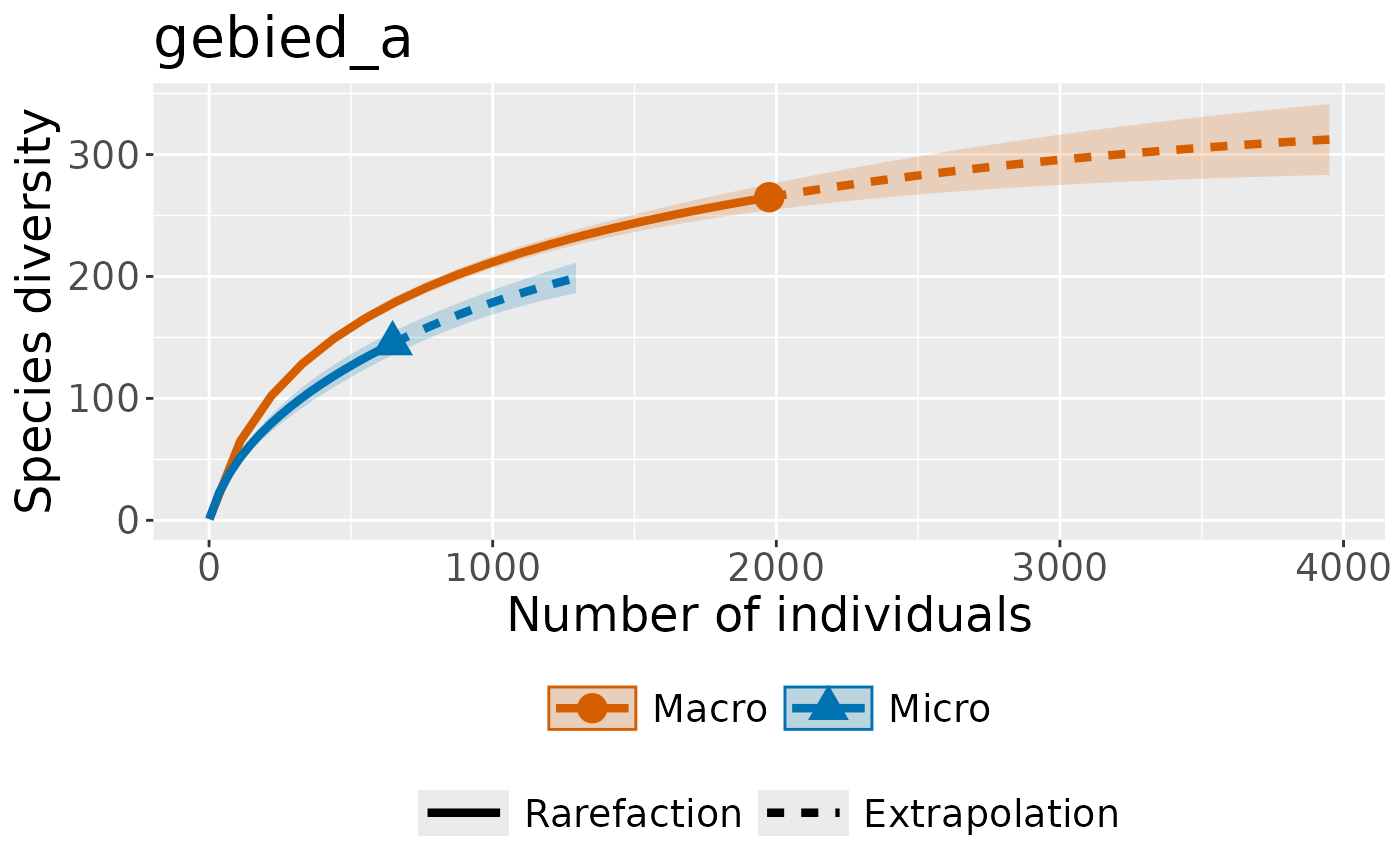
#>
#> [[2]]